The prior two months I have written about gross flows in relation to the state of the Aussie labour market, but have been too busy to provide supporting detail.
In this post, I aim to give a bit of that additional detail. There is a lot of ‘non-standard’ information that’s available in the ABS’s Labour Force survey (Catalogue 6202), and I only just skim the surface.
First of all, some background detail. The labour force survey is a survey of households. The survey object is a physical address; and once an address is added to the sample, it remains in the sample for the following seven months (so the address is surveyed once per month for eight months). If folks move in or move out of an address that’s in the survey frame, they drop into or out of the survey.
The repeated sampling of the same address means that we can ‘match’ a responding person from month to month in many cases. The fact that one eighth of the sample is dropped each month, and a new eighth is added, means that as a maximum about 7/8th (or 87.5%) of the sample can be matched. In practice, that number is ~80% – as folks move house, go on holiday, go to hospital etc.
This data set is useful by itself, as it allows one to track the transition of units between labour market states; it is also useful to compare the matched estimates and the unmatched estimates.
The latter is the simpler case (and also makes clear a potential issue with the gross flows data) so I’ll deal with that case first of all, and then look at the gross flows data. The main thing to be aware of is that the unmatched sample has different properties than the sample (that is, folks are not ‘unmatchable’ at random), and doing things in this order properly highlights that fact first up.
When you think about it, it makes sense that the ‘matchable’ and ‘unmatchable’ are different. My friends with secure jobs tend to own their own home and to stay put from month to month. My friends with a more marginal attachment to the labour force tend to both move about a lot and also tend to more frequent unemployment. Sometimes they move from job to job, and other times they move from work to holiday / unemployment.
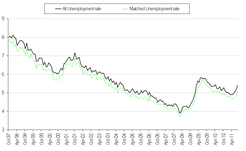
Thus, the matched sample unemployment rate is persistently lower than the full sample unemployment rate. You can see this in the above chart (note, I seasonally adjusted the full sample unemployment rate myself, rather than use the ABS estimate, as I didn’t want the different adjustment method to contaminate the spread estimate, which I show below).
The job prospects of the unmatchable are pro-cyclical, so the spread between the matched sample and full sample unemployment rate also tends to be pro-cyclical. You can see in the above chart that the recent increase in the unemployment rate coincides with a widening of the difference between the matched and full sample unemployment rates.
It makes intuitive sense that increases in the unemployment rate tend to coincide with a souring of the employment prospects of the marginally attached. Microeconomic theory supports this conclusion. Marginally attached workers ought to be the cheapest workers to shed — often simply by not renewing a contract.
Also, while the data isn’t sufficient to be sure of it, it seems probable that highly cyclical sectors would prefer these employment arrangements — which means that the sectors that employ such workers may also be the ones that are most vulnerable to a downturn.
The gross flows data support the contention that the supply-demand balance in the labour market has moved from ‘better bid’ to ‘better offered’. However, it’s a subtle shift so far, and not a melt-down.
The above chart shows the hazard rate – the probability that an employed worker will become unemployed. It appears to have bottomed out some time at the start of this year at just below 0.8% (that is 0.8% of employed workers lose their job each month), and is now probably trending up modestly (in August, it fell ~0.04% to 0.845%).
The finder-rate, shown above, is the probability that a previously unemployed person will find a job in the next period. This measure had showed particular weakness in June and July, but improved markedly in August (+3.5pts to 23.8%). The recent volatility is a worry, but if the current level holds, I would say that things are sound.
It is this measure that collapsed most markedly in the post LEH period, and it’s worth noting that it fell with a lag – so we are not out of the woods just yet. A part of that lag was due to the maths of an increase in the number of unemployed, which pushed down the finder rate, for a given (person) outflow from unemployment to work.
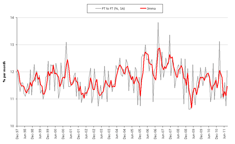
Transitions from part time to full time work also suggest weakness in the labour market. The probability of a matched unit moving from part time to full time employment declined from ~13% earlier this year to a low of just under 11% in July. There was improvement in August (to ~12%), and consequently the trend has turned up again – however it’s a volatile estimate, and there was a similar dive-and-bounce in late 2008, so I reserve judgement at this point.
On the basis of the above, I think the Australian labour market has been softening for a few months. The unmatched (or marginally attached) appear to have been losing their jobs at a faster pace, the hazard rate appears to have troughed and has risen a little, and the ease with which one might transition from unemployment to employment has declined somewhat. Also, it’s getting harder for part timers to graduate to full time work.
At this point, these developments merely confirm that things have softened. If these trends are sustained, the unemployment rate will continue to drift up, and at some point the RBA will reconsider their 4.75% policy rate.
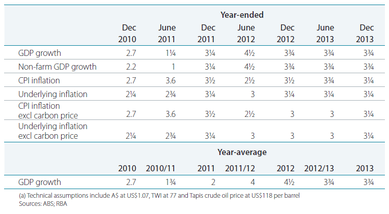
The market is priced for this to occur in October; however that seems too soon to me – unless there is a (bigger) financial crisis to come out of Europe. The Bank’s problem in the Q3 SOMP was that they forecast too strong growth, and too high inflation.
It will take a few quarters of evidence to change this – I’m guessing a least two quarters. It simply takes time to turn a 3.25% inflation forecast into a 2.5% inflation forecast (which is what’s required to get the bank to ease monetary policy).
So, is the RBA’s next move a cut? I don’t know … what I do know is that the market has basically priced in the worst (a crash / crisis), so there’s probably money in the Aussie short end.


Great info on the Labour Force survey.
I think it should not be forgotten that the Labour Force has a significant margin of error month on month and if we start considering partial data that becomes even more significant. Since values can fall within a certain range +/- , I think it would be graphically useful to always draw a wide band of possible values around each point.
For instance, the main unemployment rate could be stuck to 5.1% for many months now, instead of down to 4.9% and then up to 5.3%, if one considers the 95% confidence band. Or it could have even gone from 4.7% to 5.5%. Al these values have exactly the SAME possibility of happening, the middle point is NOT more probable than the margins.
Is that truly the case? The distribution is uniform? I had always assumed it was normal. .
Sent from my iPad
In the report they say: “The estimates in this publication are based on a sample survey. Published estimates and the movements derived from them are subject to sampling variability. Standard errors give a measure of this variability (see pages 34 and 35). The interval bounded by two standard errors is the 95% confidence interval, which provides a way of looking at the variability inherent in estimates. There is a 95% chance that the true value of the estimate lies within that interval.”
For the seasonally adjusted unemployment rate, the 95% confidence interval is reported as +/- 0.2%
i had understood that to mean that the estimatory was normally distributed … call the ABS and report back?
I sent them an e-mail earlier, I will report back.
By the way , here more details on the standard errors:
http://www.abs.gov.au/AUSSTATS/abs@.nsf/Latestproducts/6202.0Standard%20Errors1Aug%202011
“Level estimates” confidence intervals are even larger.
– there’s 66.6% chance that the real unemployment rate (all persons – Australia) falls between 4.5% and 6.1%
– there’s 95% chance that the real unemployment rate (all persons – Australia) falls between 3.7% and 6.9%
Sounds like it is normally distributed. So the probability of being in the middle is higher than the fringes.
Sent from my iPad
Yes, your assumption is correct: the distribution is normal, with points closer to the middle value having higher probability of being the “real” number. However the probability associated with each point is quite low (the sample covers only about 0.33% of the Australian civilian population aged 15 years or over) and confidence intervals are needed for the data to achieve statistical significance.
The 95% confidence interval for the main unemployment rate is +/- 0.2 %.
Other figures, that may be based on subset of the data, would have larger ranges:
http://www.abs.gov.au/AUSSTATS/abs@.nsf/Latestproducts/6202.0Standard%20Errors1Aug%202011
For instance the 95% confidence range for the unemployment rate for aged 15-19 years is +/-1.6%
With a 95% confidence interval of -/+ 0.2%, current unemployment rate could be 5.1% to 5.5%, last month 5.0% to 5.4% and June 4.9% to 5.3%. Which means it could still be stuck at 5.1% for a few months, the current trend is indeed 5.1%. During 2011 the unemployment rate hasn’t moved that much to be significant, seeing the margin of error of the survey. The next few months will be important to see if there is a real trend.
Another example of larger ranges for subset of data is the unemployment rate figures for single states. The ranges, especially for the smaller states, are very wide. And indeed, looking at the series, they are also more volatile.
I agree. The detail comments are dodgy. That is why the ‘if you take out x’ arguments are mostly to be ignored.
Sent from my iPad
One last thing :-)
In August the confidence intervals were:
5.1% to 5.5% = 95%
5.2% to 5.4% = 66%
I deduce from that that the values 5.1% AND 5.5% have 29% probability of being the real value (about 1 in 3). That is, 14.5% each (about 1 in 7, not an insignificant probability).
—
Note: I could not find any info on the rounding at the limits of the confidence intervals. Are these limits rounded? Depending on rounding, the above probability calculation could change a bit at the two extremes of the interval.