The commentary surrounding the Q1 national accounts data has mostly focused on the veracity of the data – which is fair enough given that it was much stronger than expected.
The strength of the national accounts raises the question: has the RBA stuffed up by easing policy 125bps over the prior nine months?
I do not think so. The main reason I doubt the RBA has made an error is that the Q1 national accounts suggest that there has been an increase in aggregate supply (a similar approach identified the Q1’11 inflation as the result of a supply shock). For this reason, I doubt that Gov Stevens has had any sleepless nights since the 6th of June.
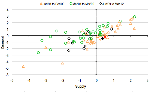
To see this, re-map the GDP and inflation data into ‘supply’ and ‘demand’ space – by rotating the x-axes and y-axes 45 degrees. The choice of the angle of rotation puts a fully ‘classical’ structure on the data – which is too strict in the short run, but will do for our purposes.
To smooth things a little, I use the 2qma non-farm GDP (3.5% SAAR for Q1’12) and the 2qma of the average of the seasonally adjusted weighted median and trimmed mean CPIs (2% SAAR for Q1’12). To make the graph a little easier to interpret, I subtract 3% (potential GDP) from the non-farm GDP estimate, and 2.5% (inflation expectations = the mid-point of RBA’s target) from the inflation estimate. Finally, to make it easier to see what’s going on, I have shaded the current point gdp-cpi pair as solid red, and the prior pair as solid black.
Having transformed the data in this way, it becomes immediately clear that demand growth has been around trend, but that supply growth has been above trend. This ought to make intuitive sense: we have had a period of strong growth and low inflation, and we normally find that combination of events occurs when supply growth exceeds demand growth.
Additionally, it makes sense that AS would shift right once again. The supply shocks in H1’11 (the leftmost points are the H1’11 supply shocks) were temporary, after all.
It might reasonably be objected that I have used non-farm GDP and CPI – I chose these because I wanted to talk about monetary policy – and that one ought to do this by comparing apples to apples. That is, one ought to compare real non-farm GDP to the non-farm GDP price series.
I think that’s a reasonable criticism, so as a check on this conclusion I show similar charts for Household Final Consumption Expenditure (HHFCE) and Domestic Demand (DD) below (the large swings in the terms of trade make the overall GDP deflator ‘noisy’ so I left it out).
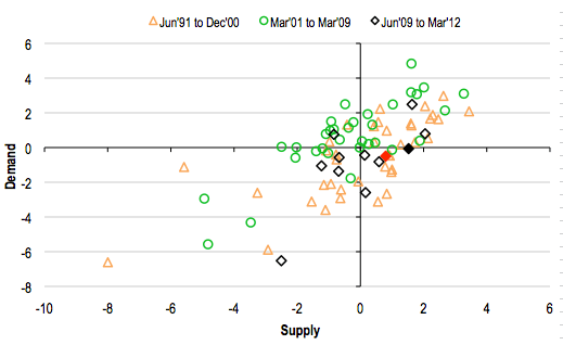
The above chart shows real HHFCE and the HHFCE implicit price deflator – again I use 2q ARs, but this time I subtract the average from 1992 to present to ‘centre’ the graph.
I think it’s clear that something is going on within the supply side of the consumer sector. I also think we have a fair idea what’s going on: 1/ on-line shopping has led to an increase in competition; 2/ good growing conditions; and 3/the repair of supply damaged by floods and other natural disasters in H1’11.
The same analysis applied to the domestic demand data also supports my hypothesis — it shows aggregate supply rising, allowing strong growth and low inflation to co-exist (in this case, aggregate supply started pushing up a little earlier, which seems accurate).
The implicit price deflators are impure price indices, as they miss substitution, so I have repeated the above using the chain price indices. The ABS does not seasonally adjust the chain price indices, so I have plotted used NSA YoY rates (again, centred by subtracting the series averages for 1992 to present).
The above chart shows the HHFCE data – where I think it’s clear that we have average ‘demand’ growth and well above average ‘supply’ growth. The below chart shows the equivalent Domestic Demand data – which also shows a big increase in supply in Q1’12.
These charts make the story pretty clear – high inflation and slow growth early 2011 was a supply shock and the recent strong growth and weak inflation pulse is the unwind of that supply shock (and potentially something more).
The increase in aggregate supply is consistent with the productivity data (gross value added per hour worked in the market sector rose 2.3%q/q in Q1’12) – and will reduce the RBA’s fears about weak productivity growth propping up non-tradable inflation.
Abstracting from the quarter to quarter noise, the long-term inflation pulse appears to have been running ~2.25% for the last two years. With the global growth outlook decidedly weak, the level of the AUD continuing to exert a good deal of restraint, and ~1.75ppts of GDP worth of ‘fiscal tightening’ in the pipes, I think that the RBA will be very comfortable with their decision to lower their policy rate to 3.5%


Nice work. Thanks. To my mind, I don’t envisage as strong household consumption for the next print, except for the mining states – then again there’s just been a household handout so I am probably totally wrong! As for your comments re the RBA, my thoughts exactly.
I guess that q2 will look bad, as some areas like food ought to come back, and that the cash payments will boost q3. Still, the structural downward pressure on prices in the consumer sector is likely to remain in place.
I think looking at the nominal aggregates might be useful.
It is unlikely we will continue to be in a disinlfationary boom.
That has been done here. it is good work, but the fact that export prices dominate his result shows why i took the view that you must not look at nominal gdp. The terms of trade are moving down, we know that – but there are other things going on as well.