I am generally a proponent of the unemployment-only take on the labour market survey – the survey is designed to measure the national unemployment rate, and that is what it does best. However, I think that the gross flows data has relevant and well measured information – so it is to the gross flows data that I turn when I want a bit more detail about what is going on.
While on the headline level, the July unemployment report was robust – the unemployment rate remains ~5.25%, more or less where it has been for the last two years – developments in the gross flows data suggest that the labour market is weakening.
The nature of the labour market survey (repeated sampling of the same units across time) allows us to examine the outcomes for units by labour market status – and from this data we calculate the average probability of transitioning between labour market states.
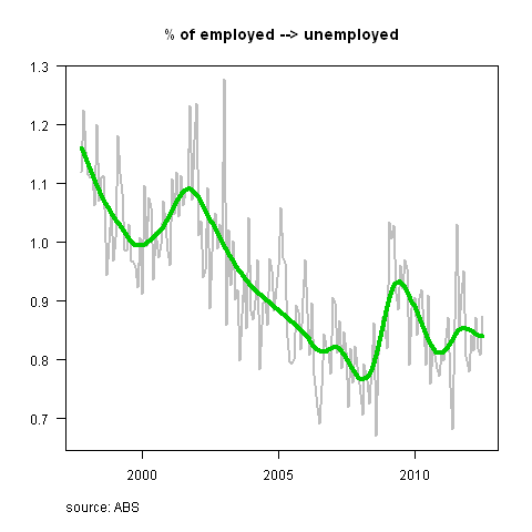
After declining in early 2012, the probability of an employed person transitioning to unemployment across the month is rising once again, and is now around 0.9% (9 people out of each 1000 employed net-lose their job and become unemployed each month). This is a low rate overall, and the trend is fairly flat – however the modest spike is worth watching as further development may presage a sharp increase in the unemployment rate.
Where we are seeing the big dump, however, is in exits from employment to not-in-the-labour-force (NILF). Based on the anecdotes, I would guess that this is the consequence of structural change – firms are making folks redundant, and they are exiting the labour force all together.
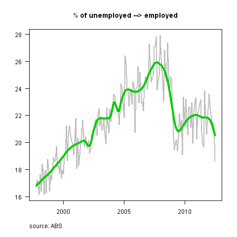
The gross flows data also show the caution of hiring managers. The probability of getting a job if you are unemployed has fallen by about 5ppts in seasonally adjusted terms, and a little less than 2ppts in trend terms. If you are currently unemployed, you chances of entering employment are no better than in Q1’09.
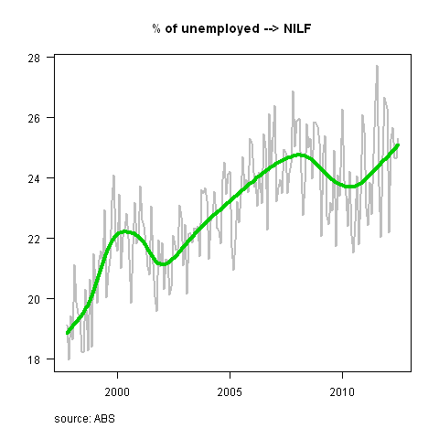
The consequence of this is that folks are giving up the search in droves. In trend terms, around one-quarter of those who are unemployed in each month give up looking for work. Some return to the search, and some enter employment directly from NILF – but many are lost (and their human capital rots, as they idle).
So, while I agree that an unemployment rate that is steady at ~5.25% is a great result, i can clearly see dark clouds on the horizon – more people are losing their jobs, and it is getting harder to find one if you are out of work.
This ‘softening’ underbelly is consistent with the ongoing weakening of job ads – and suggests that the unemployment rate is likely to rise a little further in the coming months.


Hey ricardo
I’ve done a similar analysis and while I found similiar to you i also found that the positive flow i.e. not employed to employed was also trending up. This to me suggests that there is generally more movement going on in the labour market. If the flows of either the negative (to not employed) or the positive series changes with out the other then we are likely to see a change materialise but for me the flows data just reinforce the picture that there is increased turbulance but no clear signal.
Interesting. A bit of googling unearthed thispaper by Ljungqvist and Sargent. Do you have any strong views on what increased turbulence means?
… Or do i have to read these 75 pages? :)
Lol sorry you’ll have to do the reading. But thanks for the link…I have wondered about it for a while. If I remember right the turbulence is in other series as well ie ft to pt and vice versa.
I’ll have read thanks