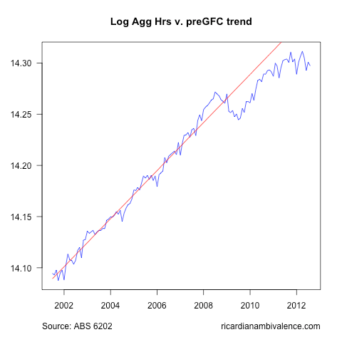
I am generally a proponent of the Unemployment Rate Only approach to the labour market report … however allow me this modest indulgence.
The aggregate hours worked data has problems on a month on month basis, however the widening gap between the pre-GFC trend and the current level of hours worked suggests that the output gap is widening … even as the unemployment rate remains low.
Once this ‘gap’ is taken into account, I do not think there is much ‘puzzle’ left in this data – those who dismiss it as ‘wrong’ are missing some important subtleties.
Looking at the gross flows data (I’ll post charts later when I get time), you can see unusually high exits from employment to ‘Not In the Labour Force’, and then unusually high re-entry to employment from Not In the Labour Force.
So we need a good story for what’s going on here. My guess is that the structural change in the economy means that we are seeing a strong increase in redundancies. After a long period of strong growth and low labour market turbulence, those made redundant are likely to receive large payments, and are therefore unlikely to actively look for work (at least initially).
These folks are highly skilled, so they re-enter employment from NILF. This has depressed the employment prospects of the unemployed searchers, and they are responding to the lower expected returns from job search (more high quality competition) by giving up the search.
So there you have it: we get the weak job ads and falling hours worked that you’d expect given dismal profits / weak NGDP growth … but (at least for the moment) we do not see a rising unemployment rate.


Makes sense to me. RBA are you paying attention?
I haven’t looked but is the 55 and over cohort dropping in participation?
The employment to population ratio has been falling.
No,
one should look at the labour force by:
1) employed which is estimated and
2)) unemployed which is estimated.
The rest is a residual
We have done this a few times now – the rates are the only thing i think are worth looking at. Everything else is muddled by the problems with population benchmarks.
Think we are going to have to agree to disagree.
Top post. That sounds basically like my interpretation.
If you are using the UE rate to give an indication of the slack in the labour market then you need to take the participation rate and hours worked in to consideration.
Also, there is likely to be a long run trend of lower participation simply through demographic changes. (http://www.macrobusiness.com.au/wp-content/uploads/2012/08/AUS_pyramid_2010.png)
The recent peak in participation rate is a product of boomers and their children (the two bulges in Australia’s population pyramid) both being in the labour force at the same time this past 6 years or so. We could see this decline a bit as boomers drop out, and the smaller school age generation comes into the labour force. It all depends in the age profile at retirement, which I think will increase in the coming decade as well.
Thanks for shining some light on the puzzle.
Great post… the ‘redundancies’ explanation is smart but it does not completely convince me :)
If I am not mistaken the participation rate is simply back at 2007 levels, when the economy was very strong, so it is not that unusual ?
True. Could be lots of things, including demographics.
During the GFC, there were many stories about people having to work longer and being unable to retire due to share prices crashing or not being able to sell their property etc….. so maybe they can finally retire now. It takes at least a year of planning I reckon.
Again I refer to this nice graph by Mark :)
http://markthegraph.blogspot.com.au/2012/09/unemployment-rate-falls-but-in-not-good.html
(third graph)
Decent point. It could be demographic.
I think the most interesting transmission mechanism to slower growth if what we have is a permanent move out of the labour force is via fiscal policy. If the participation rate keep falling it means more of the deficit is structural, which makes balancing the books that much harder.
It may turn out that we wasted a double boom – both a mining and participation boom.
The required fiscal tightening would make room for further easing from the RBA.
Has a decreasing participation rate an inflationary aspect too?
If the pool of available workers is smaller, workers in general can demand higher salaries…
The US data also seem to show a significantly falling participation rate.