
The monthly US PCE report is one of my favourite. US consumption is not just a bit part of the US economy, but a big part of the engine that has driven global growth these past few decades.

The August PCE report had a few okay signs, but was mostly in the realms of ‘not good enough’. The trends remain ‘too slow’ PCE growth: an output gap found by passing a line through historical growth shows that the difference is getting larger — not what you want at this stage of the cycle.
My guess is that this very large ‘demand gap’ is a decent part of the reason that global inflation remains low.
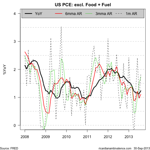
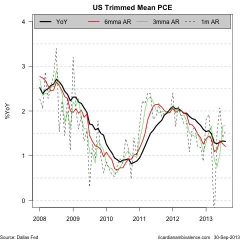
On this subject, the August PCE report showed still-tame inflation.
Headline PCE inflation picked picked up 60bps to a 1.7% AR pace in August, and volatile prices were not a large part of the story (ex food and fuel was 1.9% AR, while trimmed mean PCE was 1.6% AR). After peaking early in 2012, trend inflation pressures have eased markedly (the 6mma AR is 1.1%y/y, and the annual pace is 1.2%).
Trimmed mean PCE inflation was 1.6% AR on the month, taking the 6mma AR down 10bps to1.2%% (YoY 1.3%). That’ a very low (broad based) inflation pulse.
All told, i think that inflation pressures are too low for the FOMC to contemplate tightening policy. indeed, i think it was a mistake to discuss tapering at all — without the 85bn/m of bond buying, growth would be slower, unemployment higher, and inflation lower.

Thanks for the post. What is the slope of that trend line (in %)?
the trend line is the prior cycle, and it’s 0.557%m/m — which is around 6.75% AR pace. Perhaps that’s touch on the high side, even if we had ngdp running at your ideal of around 5%y/y. I don’t need the prior trend to make my low inflation case stick — all i really need is the obvious point that capacity was being added in 2007/8 in anticipation of something like the prior trend. It’s no wonder that firms have been slow to invest this cycle. outside of a few sectors, last cycle’s investment hasn’t really paid off very well.
Sorry – this perhaps reveals my lack of familiarity with the data: why is the graph labelled (log) real PCE? PCE of 6.75% is a bit high for nominal consumption growth but super high for real consumption growth.
But I take your broader point – consumption growth has been a lot slower this time around. Presumably the appropriate response is to prod it back up to something more like 5%? Conversely, Chris Joye had an article today talking about why this housing boom is different, on the basis that household disposable income is growing at 3% this time unlike the previous 6-8% at previous peaks (even 10% in late 07/08). He reckons this is the new normal and so we need to get used to lower house price growth. Perhaps. But it’s a similar issue as the US with a different reaction. I would prefer we got back up to 5-6% NGDP growth here rather than continue a somewhat painful adjustment to 3-4%.
Interesting… what Joye says is correct, I believe, and again it can be explained by lack of broad money growth; it is not even comparable with 2002, 2007 or 2009 … as per broad money graph below. If total money does not grow as it used to, and we are building more houses, guess what house prices will do?
If folks hold more equity and less TD, they hold less broad money, but i bet that’s an environment which is more boom-like. Money, even broad money, never worked like it does in textbooks.
but the broad money y/y pretty perfectly match the economic conditions in Australia of recent years including inflation , interest rates , UE and house prices. I bet if broad money does not pick up , housing conditions will flatten out very soon and more cuts will be coming. Let’s not forget this housing boom is coming after recent falls so actually prices have gone nowhere in the last 3 years, and some cities still haven’t recovered. I will follow the financial aggregates and bet that the RBA will start taliking abut rate increases as soon as broad money q/q goes to 2% or higher.
What’s the cost of 85bn per month bond buying? Nothing is free not even money printing. If it’s working , then why not 850bn bond buying instead ? or 8500bn even? With 8500bn, would unemployment be 0% and the dow at 30000? This is a mess. How much demand in housing have they pulled forward with such low rates? Would inflation really be lower with 40bn instead of 85bn? This all feel like a psychological game with markets rather than real money mechanics.
Ricardo, Rajat,
I have been following the “Broad Money” aggregate released monthly by the RBA with some interest… August was negative m/m (!) and very low y/y. I think the graph below speaks for itself. Now consider that rates are at record low already. So where is the housing “boom” coming from?
y/y broad money growth:

Is this a coincident, lagging or leading indicator ?
yeah, i noted the same thing. The $ drop in broad money is smaller than the $ drop in M3, which suggests the drop all came in M3 classes — which points to term deposit liquidation. perhaps folks are switching out of TDs and into housing? that’d explain the move.
as for if money leads or lags, many people claim that real money balances lead, but money can be both a cause and an effect so it’s not straight-forward.
rule of thumbs say it leads. I say it’s mostly a residual that’s determined by other (more meaningful) settings, such as the level of rates.
thanks, the graph seems to match very well the RBA rates and seems to point to further cuts if conditions do not change.
I am no expert, but if I liquidate my term deposit to purchase a property I will most likely create a new loan which should increase not decrease the total money supply? Also I’ll pay someone this money which will end up back in the bank or a bigger property with a bigger mortgage, once again increasing the total money supply?
For me house price increases require fast credit growth, so the current increases can only be explained by cheaper properties being purchased (e.g. by investors) for rental purposes and/or lower total transaction volumes (same amount of money used to purchase fewer properties).
The graph matches the 2006-2008 housing boom and the 2010 too: when broad money increases fast so do house prices and rates go up. In this case it does not seem to reflect what is reported in the field.
I wonder if M1 leads (as the RBA effects easier policy) and the broader aggregates lag?
Looking at the graph, broad money looks coincident to me…. and it’s also interesting to see that when it falls y/y below 5% it seems then to collapse to 0%. If I had to put my money on the future of broad money, I think we will get an election mini-jump for a quarter or so, with the RBA on hold, then back down towards 0% and RBA delivering further cuts in 2014. Broad money falling also points to a generally stronger than expected AUD and cash will still be king.
PS no way we get sustained inflation unless broad money recovers to at least 7.5% y/y