
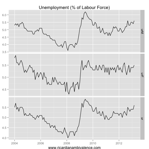
The ABS yesterday released the first part of the quarterly labour force detail (this was the bit showing the characteristics of the unemployed, including the duration of unemployment).
I like the ratios in these reports (as usual — as i don’t trust the population benchmarks), and the ratio that is interesting in this report is the long term unemployment ratio. It is a lagging indicator by definition, but it is a good check on what one might think is going on based on the monthly unemployment release.
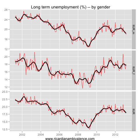
This (Q1’13) report challenged one of my assumptions about the labour market — that men were taking the brunt of the unemployment. This report shows the proportion of men who are long-term unemployed has continued to trend down. The ratio remains high, relative to the very low levels seen prior to the crisis, however it is lower than late 2011 and is trending down.
Female long-term unemployment has been stuck at ~18% for a few years now, so the population ratio is gradually trending lower.
This might reflect nothing more than impatience on my part. The increase in the male unemployment rate is perhaps too recent to swell the ranks of the male long-term unemployed just yet — whereas the female unemployment rate never went back down after the GFC, so more of those that are unemployed now are long term unemployed as they never got a chance to resume working.
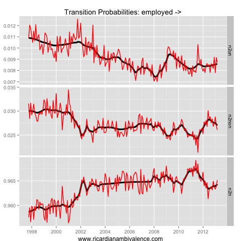
Looking at the gross flows data (from the monthly pub), perhaps another reason for this is that those who have lost their jobs (mostly men of late) have tended to exit the labour force. This may be related to redundancy payments, or perhaps is related to industry structure (self-employed construction workers often don’t ‘search’ for work in a way that satisfies the ABS’s definition of unemployed).
There is a gradual trend up in transitions from employment to unemployment, which suggests some fresh weakness — but as yet it’s only suggestive.
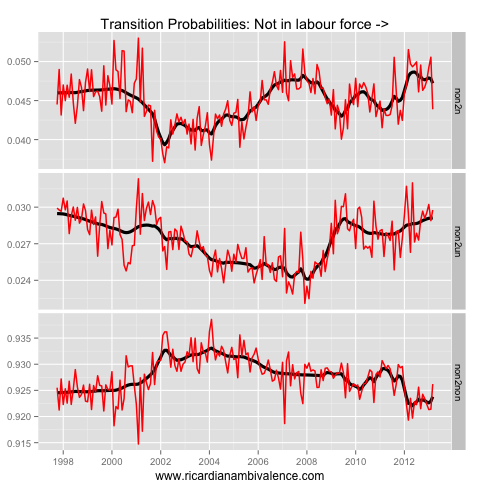
The transitions from not-in-the-labour force show what’s different about this cycle. As you can see in the prior employment transitions chart, those who lose their jobs haven’t searched, they’ve exited the labour force — the transitions from not-in-the-labour force suggest they often (later) re-join employment without first becoming unemployed.
The worrying sign in the March data was the sharp drop in transitions from not-in-the-labour force to employment. The trend up in transitions to unemployed suggests that folks are beginning the search for employment once again — this could be a good sign (a response to a better labour market) or a bad sign (perhaps their redundancy payments are running out?).
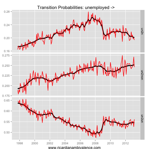
The gross flows for the unemployed suggest the second explanation: things are getting harder for the unemployed. The probability of going from unemployed to employed continues to trend down, and is now lower than in 2009. It’s getting harder and harder to find a job, and therefore the probability of quitting job search is rising (as the returns to search are falling).
There has been a gradual uptrend in the probability of remaining unemployed, and this suggests to me that the long term unemployed ratios ought to track up over time.
