
Today’s speech by RBA Gov Lowe said that they were puzzling about the concurrent GDP slowdown and strength in the labour market.
Other indicators of the economy, though, paint a softer picture. We will receive another reading on GDP growth later this morning, but growth in the second half of 2018 was clearly less than in the first half. This is similar to the picture internationally. In a number of countries, including our own, there is growing tension between strong labour market data and softer GDP data. We are devoting significant resources to understanding this tension.
As you can see from the charts below, this is something of a non-puzzle.
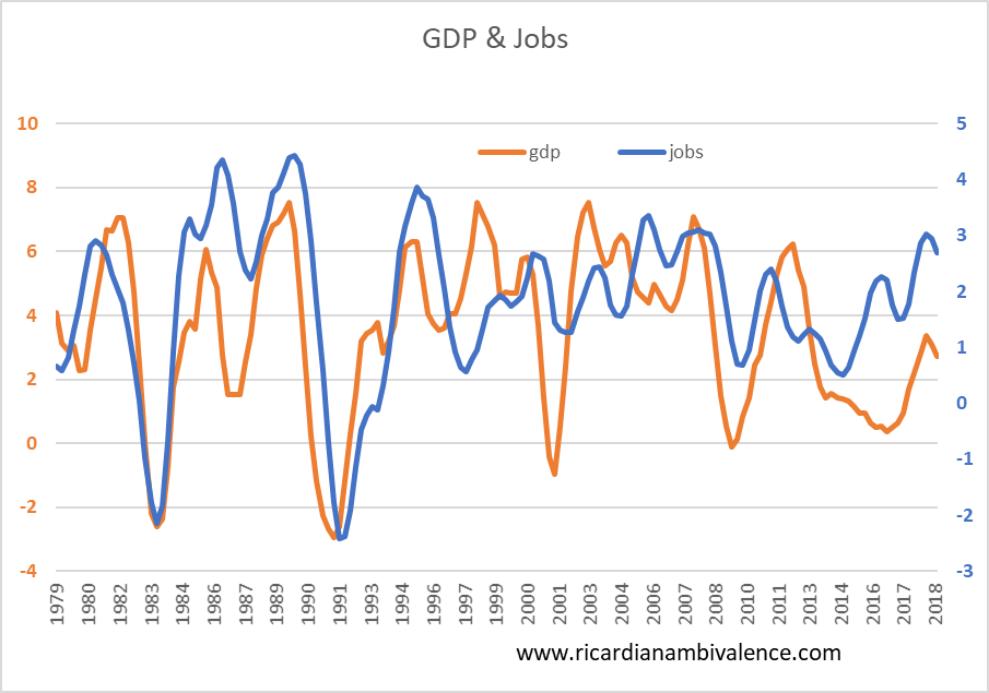
The first chart (above) simply shows a GDP measure (I used private domestic demand) v. Jobs: as you can see, the orange line (GDP) tends to lead the blue line (jobs) down. This has happened in pretty much all cyclical downturns.
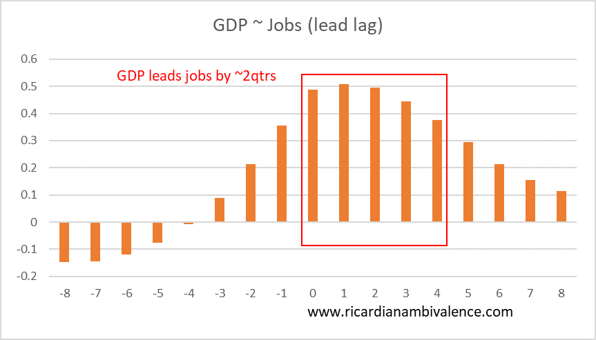
The next chart (below) shows the lead-lag correlations between GDP and Jobs. The higher the number, the greater the correlation. As you can see the great mass of correlation is between concurrent (x axis label = 0) and a one year lead (x-axis label = 4).
I think Lowe’s message was that if slow GDP growth shows up in Jobs he’ll cut. History suggest that’s not too far away.

it would mean their forecasts are wrong.
I am not convinced cutting dash rates from 1.5% to 1% will do all that much.
time for fiscal policy me thinks
I think you’re right about the threshold for cuts. But how do you explain the 2016-18 jobs boom during a period of tepid growth?
lower unit labour costs
Give me more?
What do you mean?
Yes i mean “what do you mean”. Can you say a bit more about unit labor costs?
lower unit labour costs encourage employment.
The RBA has written about this