
[This is the third in a series looking at the February employment report: here are links back to the first and second]
In the comments, I often talk about gross flows in the Australian labour market — but seldom show the work. I like the gross flows data, as they offer a window on the dynamics of the labour market at the micro level. The labour market is a much more dynamic place than most realise.
As a large portion of the units are re-sampled month to month, the data allows us to track how ‘state’ changes from one month to the next. In the charts below, i summarise this by the probability of moving from one state to the next.
For example: we can see how many people are employed in the prior month, and what happens to these units in aggregate. By taking ratios, the data allows us to estimate the proportion of those people who were employed that remain employed, become unemployed, or exit the labour force.
In the below, i show the transitions from employment, unemployment, and not-in-the-labour force (to employed, unemployed, and not-in-the-labour-force).

The big change over the last year or so has been in transitions from employment out of the labour force. In the GFC there was an concurrent increase in transitions from employment to both unemployment and out of the labour force as the economy swung down, but this time folks are exiting employment without becoming unemployed.
Exits from employment to unemployment settled down in 2009, and it got fairly easy to keep a job by early 2011. However since mid 2011, the story has been one of folks moving from employment directly out of the labour market without a sustained rise in exits to unemployment. I suspect this reflects an increase in redundancy payments — which is what you’d expect as the economy restructures under a higher AUD following a 20yr boom.
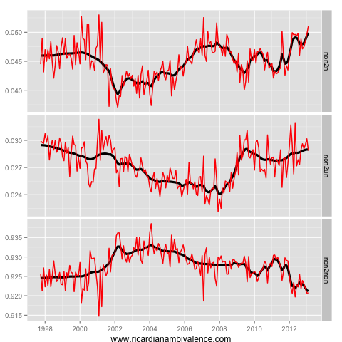
A key reason to think that this might be redundancy of highly skilled workers is that these folks don’t remain out of the labour market. They are re-entering the labour market is pretty much record numbers.
Those who are currently out of the labour market are unusually employable. Entries directly into employment (from not-in-the-labour force) are ~5%, which is cyclically high.
These folks also re-enter to search for work — and again the rate is cyclically high, though not quite so extreme. Each month, around 3% of those that are not in the labour force enter unemployment (which means they start searching for work). The last time it was this high was late 2009, when the economy was strong.
These facts challenge the claim that the participation rate is low due to discouraged workers. Those who exit the labour market re-enter in good numbers.
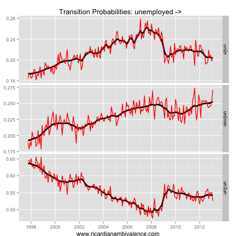
A certain amount of discouragement does seem to be inevitable. The returns to job search are lower. At ~20% per month, the probability of a unit moving from unemployment to employment is as low as it was in early 2009. With the returns to search so low, it’s no wonder we are seeing some exit from unemployment to not-in-the-labour-force – this would be the ‘give-ups’.
Only ~55% of those who search for work but don’t find it continue to search the next month. 20% find work, and the other 25% stop looking. Perhaps these folks are crowded out by those that move back into employment from not in the labour market
Some of this may be a side effect of ‘nice’ supply side dynamics (those who are highly skilled and comfortable are taking a rest between jobs), but in the long run a strong labour market would have higher transitions from unemployment to employment.

So while things are turning up in terms of labour demand, it seems fairly clear that the labour market remains a challenging place to be – especially if you do not have a job. While the growth of hours worked and employment appear to have picked up somewhat, this is partly due to sample issues and population growth.
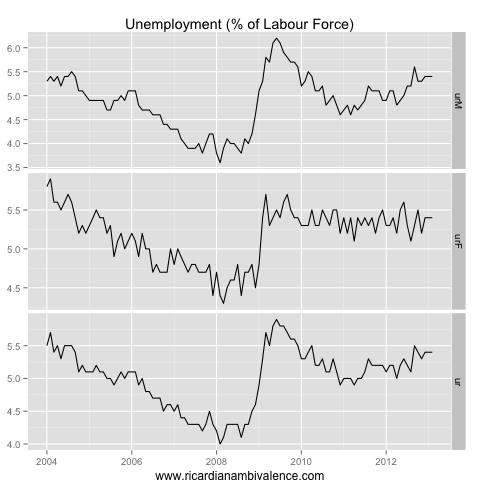
The boring fact remains that the various rates (and not hours or employment growth) remain the best indicator of the labour market’s state. The unemployment rate is the best measure — and it’s been trending up gently, due to a softening in the Male labour market.
A look at the gross flows shows that it’s getting harder to keep and job if you have one, and harder to find one if you become unemployed – so the details remain weak.

Even just the rates have a significant sampling error. The seasonally adjusted rate 95% confidence interval is between -0.2 pts and + 0.2 pts. Now just think what huge difference to rate expectations a 5.2% vs a 5.6% seasonally adjusted unemployment number would have made. To billions of forex transactions that move every day. To millions of words written about the Australian economy. And even to the upcoming election!
It is peculiar that most other employment data would seem to point to higher unemployment and this seems the only report that is holding up so far.
The unemployment rate is holding in there, but i don’t think the details are all that healthy. Still, there is so much uncertainty about supply and demand side changes, that a stable unemployment rate demands some respect.
another good article. congratulations
you are on tomorrow’s Around the traps in a number of areas. look out for Bead De Long’s demolition of Cochrane.
Write a response!!
good to have you back after a break.
We need you.
Thanks mate. I am trying to make it regular.
Some strong retail sales numbers today, FWIW. Also, good to see the BoJ going in hard on deflation. Should help us a bit.
Bernanke’s legacy, if it works, will be the Japanese resurrection.