
The April employment report has led the the predictable ‘we was robbed’ response from many of those who got the May meeting wrong. I got the April RBA meeting wrong too, but you won’t read that assessment below. Rather, i think that the April report conforms pretty closely to the RBA’s assessment that employment is growing too slowly to eat up the slack (in trend terms).

Looking at the unemployment rates, the ongoing uptrend in joblessness is fairly clear, despite the decline to 5.5% (down 10bps) on the month The increase in the female unemployment rate is a bit of a concern, as it suggests that weakness may be spreading to the services sector (which has thus far been firmer than male dominated sectors).

The change in jobs (k per month) looks good, with solid gains in both part time and full time employment, however this should come with a health warning! The survey is designed to measure the unemployment rate, and it does a pretty good job of that – the employment number is mostly error from month to month. Notwithstanding, employment rose 50.1k, with full time jobs about two thirds (34.5k) of the total.
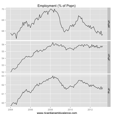
The participation rate has been moving around a lot of late (+20bps to 65.3%), so a better measure of the slack in the labour market is the employment to population ratio (+20bps to 61.7%). There was a tiny bounce in both the male and female employment to population ratios (though despite the +10bps rise to 67.7% on the month, the male ratio remains in a downtrend). This gave the impression that just maybe the ratio is stabilising … Maybe! Let’s hope.
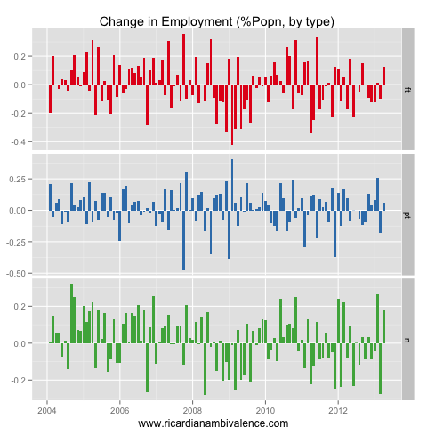
A decent way to take the population noise out of the jobs data is to look at the change in the proportion of the population engaged in each type of work. On this measure, this was the best employment report in some time, with the full time proportion rising in a meaningful way for the first time in three quarters (the feb jobs explosion was mostly part time so i rate this as a much better report).
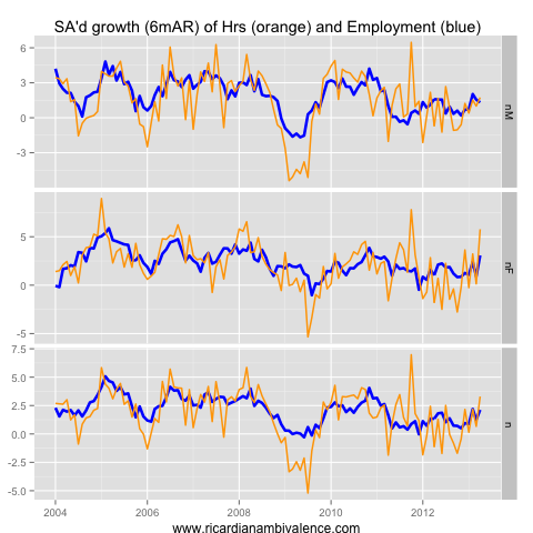
The uptrend in hours worked (+0.7%mom) is probably the most impressive part of the report. In ‘normal’ cycles the pattern is hours first, then job ads, then jobs, so the sharp move up in hours is very encouraging. As a level, hours are now above the q4 2011 peak, which is a decent sign that the RBA has some policy traction, and that things are turning around.

Finally, the matched v unmatched split of jobs growth is very encouraging (to the extent you think my seasonal adjustment is reliable!). All of the jobs growth in April came from an increase in employment among the ‘seasoned’ part of the sample.
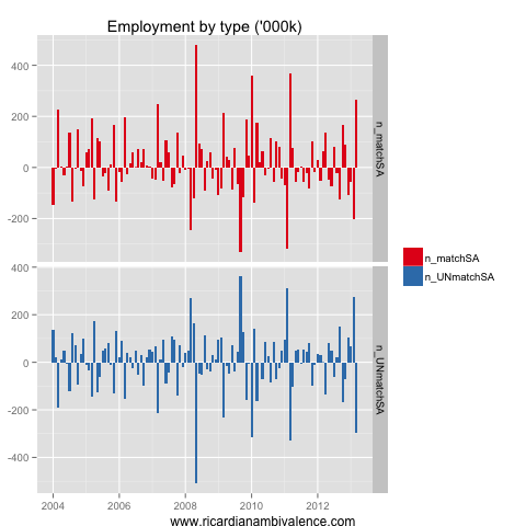
You can see above that the change in matched sample and unmatched sample employment is extremely large from month to month. I am not sure i am doing this correctly, but to the extent that you trust it, the message is that sample rotation actually detracted materially from employment growth – so that but for sample rotation employment would have been even better. Take the apparent levels with a grain of salt, but the key point is that this is probably not noise (like Feb).
So if this is such a good quality employment report, why do I not think the RBA made a mistake on Tuesday? Because there is loads of slack in the labour market (see the employment to population ratios) inflation is low, and I am still pessimistic about how the end of the mining boom will pan out.

got it too.
I will give mt Chris Caton impression now.
The survey measures employment and unemployment.
the participation rate is merely a residual
This was always a talking point in the mid 80s to early 90s in the market.
A bit of common sense prevailing here
Can you tell your mate C.Joye to calm down a bit though?
Going on about how the AUD rallied beyond where it was before the rate cut….if only he waited another 24 hours and he would see its now 2c below those levels
This move is significant because:
– It broke the trading range
– but most importantly, it has happened without a one-off risk-averse event, such as Greece risk of defaulting, or earth quakes, etc. Actually risk is still fully on and still AUD got lower. Hasn’t happened for many years/months.
The RBA cuts seem to have finally got traction on one thing: making the AUD less attractive.
If that holds (a mild / partial decline, without completely collapsing), I think it’s very good news for Australia and very good times will be ahead for all of us. But Forex is very hard to predict, so who knows what’s next! I am still not 100% sold on the US recovery, but signs are promising.
I think it is just that usdjpy broke up and usd shorts had to cover. A big dollar short squeeze developed, and that sucked the crosses all lower. Same trade pattern occurred when usdjpy moved fast a number of times over the last few months.
slide started when jobless claims got to 5 years low…. it was a rush back to own USD on better US economic data, where in the past it would have pushed risky assets (incl. AUD) up. It also sent Gold down. After such a good employment number from Australia it was very surprising for many and yes, short USD vs all crosses were squeezed, but AUD was particularly weak also vs EURO. It hasn’t even bounced off so far, very strange again.
Hi RA
You’ve mentioned before and here that the ABS survey is designed, mainly, to measure the unemployment rate, but I have to disagree with you somewhat. The survey is designed, as all surveys are, to measure proportions, yes and the UR is a proportion. But as you are aware it is a very limited one and I would argue does not reflect the future supply of labour very well.
First point, the definition of unemployment is so strict that it excludes much of the available labour supply. In fact, if you look at the transitions in the gross flows you will notice that much of the movement to employed from not employed is from those classified as Not In the Labour Force and not unemployed. Meaning that the unemployment rate is NOT a reliable indicator of future supply as most of the supply comes from those that are not unemployed.
The second point is that the underemployed represent a larger proportion of available labour supply than those that are unemployed. Furthermore, this group is more likely to have a greater impact on inflation as they will likely have a larger proportion of disposable income than those that have just got a job.
While the UR may fit into models that provide some clues about future inflation they are conceptually misguided. That is, the UR does not represent future labour supply. The reason it has probably worked in the past is that like all labour market indicators from the ABS survey (the proportions) they are all correlated with one another. Meaning that when underemployment increases, employment usually decreases so the unemployment rate will naturally increase as a consequence.
Focusing on just the UR in my opinion is a little misguided. Instead, the employment to population ratio and the underemployment rate provide a much better indication of labour market conditions. And if the ABS decided to actually fix the survey a real rate of potential supply could be derived, i.e. identifying all people who want to work would be great.
Thanks, a good and thoughtful post. If the survey was aimed at measuring jobs, it would be an establishment survey, no?
agreed and its a shame it was dropped a few yrs back. As it currently stands though the UR is probably the least useful indicator in terms of quantifying potential labour supply. But its published monthly and in an easy format so is routinely used. Would be better if the ABS published something similar to the BLS U rates.
Least useful? What do you think is the best monthly indicator?
Well monthly its fairly limited but I derive rates using the NM1 data cube and the gross flows. The underemployment rate is much better than the UR for labour supply simply because it represents a larger potential supply, but its quarterly. If the survey could adequately identify all people who wanted to work more informative rates could be derived.
I say the UR is the least useful simply because it doesn’t reflect intentions. More people transition from NILF to employed than Unemployed to employed. Meaning the supply of labour is not accurately reflected by the UR.
If you would like to write a post showing how you do this and why it is better, i would be happy to host it as a ‘guest post’. Please consider. The labour market post are some of the most read each month.
By the way, my view had been that these data are so correlated with the UR measures that all the difference gets eaten by the beta in a regression, but the movements in participation rates these last few years have challenged that view. Very interested in other views.
I think the correlation will continue to deteriorate and this may accelerate in the next few months. The abs is implementing self enumeration for this survey so I think there will definitely be a change in the way people respond. In my opinion this will cause a level shift that wont be obvious until much later. My contacts tell me it isn’t going too well either.
As for the post I’ll give it some thought, I probably approach the survey very differently to most of your readers, less of an economic slant more social policy viewpoint.
Nothing wrong with that. Very keen, but don’t feel obliged. Pleased to have your current contribution and no obligation for more.
Any chance those getting jobs from being not in the labour force are students finishing school or uni and going straight into graduate jobs? Also employment to population might fall due to baby boomers retiring – they started turning 65 in 2010. Not saying this would explain all or most of it, but it could be a factor.
From memory excluding the older age groups does explain some of the drop. You can try a few different population denominators and they give different trends, especially over the past 3 years. This is a fairly useful exercise and can be done with other groups as well. For instance removing people who have no intention of working or can’t work gives some interesting results as well.
The student thing is fairly seasonal and represents a fairly small part of the movement from NILF to employed. You can pretty much exclude the student effect by removing 15 to 24 years or 20 to 24 years from the analysis. The stuff that I’ve done in the past shows that the 15 to 24 movements are pretty much in line with other age groups, but this changes at different times of the year.