
Following on from my casual survey of the relationship between various measures of demand and inflation, I thought it appropriate to complete the picture with a look at some Okun relationships (the ‘relationship’ between changes in demand and changes in the unemployment rate). Also, I think it relevant given that the market is 50/50 on a July cut — as Thursday’s jobs report will surely swing pricing.
The good news is that the theory works OK — there is a decent relationship between various measures of demand and subsequent changes in the unemployment rate (I use qtr average unemployment). The bad news is that the recently weak pace of demand growth suggests a further increase in the unemployment rate — a Q2’13 average unemployment rate of ~5.6% is in keeping with the data, and a 5.7% average seems plausible.
This makes a July rate cut likely, and an August encore (if CPI is low) possible.
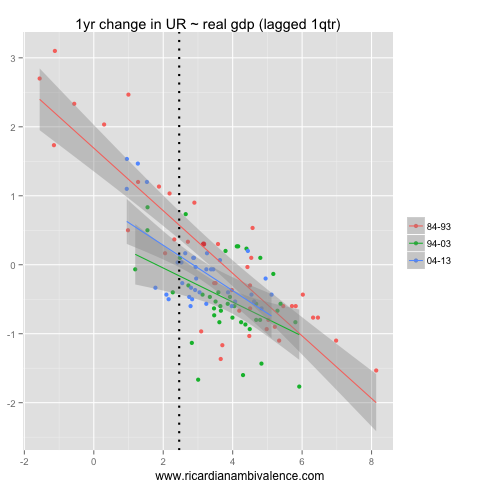
The first ‘model’ (shown above) plots the relationship between GDP growth (measured in YoY terms) and the 1y change in the unemployment rate (lagged one-quarter). To make a concrete example, say GDP growth is ~2%y/y in the year to Q1’13, then history suggests the average unemployment rate in Q2’13 will be ~25bps higher than in Q2’12. At present, it’s gone up a bit more than that despite growth of ~3% in the year to Q4’12 (which is why productivity is looking better!) — and the pace of prior growth suggests the unemployment rate should be steady at around this level, or fall back a little in Q2’13.
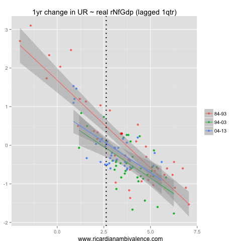
As important as it is, agriculture marches to its own drum, so it is best to exclude it. Using non-farm GDP we find a similar relationship — the increase in the unemployment rate over the past year is a little more than average given the prior pace of growth, and the current pace of growth suggests the unemployment rate may even decline somewhat in Q2 (as it should be around the Q2’12 average of 5.25%).
Both the GDP and non-farm GDP conclusions are hard to square with the weakness in measures of labour demand (such as job ads and business hiring intentions) — and various anecdotes (to the extent that they are reliable).

The job ads data is more easily squared with the domestic demand data (recall all the anecdotes about net-exports not employing as many people as investment? … well I agree). Like the GDP measures, we have a robust and consistent relationship between the pace of demand growth and subsequent innovations in the unemployment rate. Indeed, this one is more stable over time. The labour market is presently a bit weaker than you’d expect given the prior pace of demand growth, and the unemployment rate ought to rise further still through Q2 given the abrupt slow-down of domestic demand growth in Q1’13.
History suggests an average unemployment rate of ~5.75% in Q2’13.

An alternate measure of domestic activity is GNE (which is domestic demand + inventory adjustments). This is basically the same as the domestic demand chart — including it being a similarly consistent relationship though time. At the margin it’s a bit worse: a Q2’13 average unemployment rate of ~6% would fit the historical relationship. This would mean a sharp spike higher of the unemployment rate in Q2’13.
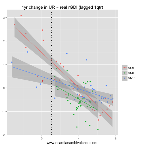
A concept which some think is superior to these measures is real gross domestic income — this measure captures the change in income due to movements in the terms of trade, but remains ‘real’. This measure shows that the prior increase in the unemployment rate (of ~30bps) is a little lower than might have been expected given the prior drop in economy-wide income, and that there should be a further increase of about the same in the year to Q2’13 (which means the Q2’13 average remains around ~5.5%). This seems reasonable to me.
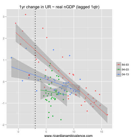
Finally, we come to nominal-GDP — I had to include it all for the nominal-GDP wonks out there. The recent increase in unemployment is consistent with the prior weakness in nominal GDP, and the improvement in Q1 n-GDP growth suggests that the unemployment rate should hold steady at ~5.5% in Q2.
Taking the average of these six approaches suggests a Q2’13 average unemployment rate of ~5.6%, which would be consistent with May unemployment at ~5.6% and June unemployment at ~5.7%.
This is my base-case, but i see the risks as skewed toward higher numbers. I doubt the real and non-farm GDP models, and if I dismiss them, I get a Q2’13 average unemployment rate of 5.7% (this is the average of the DD, GNE, n-GDP and rGDI models).
To achieve that, you’d have to see a 5.7% unemployment rate in May and a 5.9% unemployment rate in June. This path seems a bit sharp, but would fit reasonably with the anecdotes and high frequency labour demand indicators.
A 5.7% unemployment rate for May should seal a cut at the July RBA meeting (this is what I expect). A 5.9% rate in June and a low CPI might even secure an encore in August (though a pause still seems more likely).

great work mate!
Thanks :)